
Neutral Colours in Interior Design: The Art of Timeless Sydney Styling
What if the most powerful tool in your design toolkit isn't a bold splash of paint, but the subtle, quiet strength of a perfectly balanced palette? Many Sydney homeowners fear that choosing neutral colours will result in a clinical, "all-white hospital" look that lacks soul. In reality, these shades are the heartbeat of a sophisticated home. They provide a curated foundation that allows your life and your style to breathe. We believe that a home should be an emotional sanctuary, not just a collection of furniture.
We understand the hesitation. Choosing between a warm taupe and a cool grey can feel like a high-stakes gamble, especially when you're trying to match existing timber floors or capture that elusive feeling of "home." You want a space that feels expensive and inviting, yet you're worried about getting the undertones wrong. This article will help you master neutral palettes to create a high-value property that resonates emotionally and stands the test of time.
You'll discover why the 2026 shift toward warm neutrals like "Cloud Dancer" is transforming Sydney interiors. We'll also share our professional secrets for layering textures and navigating the "fifth wall" to ensure your environment feels intimate, cohesive, and deeply personal.
Key Takeaways
- Redefine your understanding of the "new neutrals" for 2026, moving beyond basic white to create a warm, emotional sanctuary that feels deeply personal.
- Master the secret of hidden undertones and learn how Sydney’s unique natural light can transform your palette from flat to sophisticated.
- Discover the power of "visual weight" and how layering rich textures prevents neutral colours from feeling bland, creating an expensive and curated aesthetic.
- Gain the confidence to style for your specific locale, whether you’re perfecting a coastal Hamptons look or honouring the heritage character of a North Shore Federation home.
- Learn the art of emotional curation to select bespoke pieces that narrate your home’s potential while building significant value for a future sale.
What are Neutral Colours and Why are They the Foundation of Chic Design?
Neutral colours are often misunderstood as a safe or "boring" choice. In reality, they represent a masterclass in restraint and intentionality. They aren't just the absence of pigment; they're a deliberate design choice that prioritises feeling over flashiness. For a home to truly become an emotional sanctuary, it needs a foundation that doesn't compete for attention. In Sydney’s fast-paced environment, our homes must act as a soft place to land. A curated neutral palette provides exactly that. It creates a sense of quiet confidence that allows your life, your family, and your stories to take centre stage.
We see neutral colours as the gold standard for property styling because they possess an unmatched versatility. They highlight the architectural bones of a Sydney terrace or the sleek lines of a contemporary apartment without distraction. Understanding The Psychology of Color in Design helps us recognise that these shades aren't passive. They actively influence our mood by promoting a sense of calm and order. This emotional resonance is what transforms a house from a mere structure into a home that people fall in love with the moment they walk through the door.
The Spectrum of Modern Neutrals
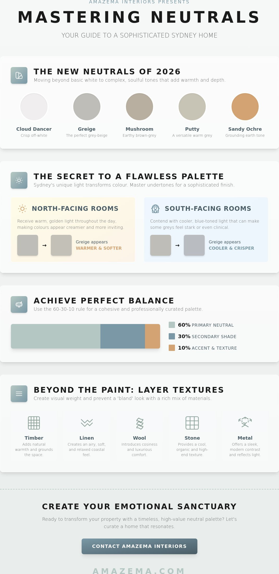
The "new neutrals" of 2026 have moved far beyond the basic whites and flat beiges of the past. Today, we look toward more complex, "muddy" tones that offer depth and soul. Greige, mushroom, and putty have become the essential bridge between warm and cool, allowing for a seamless flow between different rooms. We're seeing a beautiful shift toward earth-derived tones, such as terracotta-based whites and sandy ochres that ground a space. In minimalist Sydney apartments, achromatic neutrals like soft charcoals and "Cloud Dancer" off-whites provide a crisp, clean backdrop that still feels welcoming rather than clinical. These shades respond beautifully to our local light, shifting in character as the sun moves across the sky.
Neutrals as a Strategic Investment
Choosing a neutral base is a pragmatic financial decision as much as an aesthetic one. It protects your home against the rapid cycle of interior trends, ensuring your space remains relevant for years to come. A well-executed neutral palette also maximises the perceived space and natural light within a room, which is a vital factor in the competitive Sydney property market. Successful chic interior styling Sydney relies on neutral foundations to ensure every custom piece and curated texture has the space to breathe. By investing in a timeless backdrop, you create a high-value environment that appeals to the widest possible audience while maintaining a deeply personal, sophisticated feel.
Understanding Undertones: The Secret to a Sophisticated Palette
Mastering neutral colours is less about the paint on the brush and more about the light in the room. Many homeowners feel a sense of frustration when a shade that looked perfect in the showroom suddenly appears muddy or jarring once applied to their walls. This shift happens because every neutral has a "hidden" undertone. These subtle bases of pink, yellow, blue, or green are the invisible threads that either weave a room together or pull it apart. To create a truly sophisticated home, you must learn to see beyond the surface colour and identify the temperature of the light it reflects.
In Sydney, the orientation of your home is your primary guide. North-facing rooms are blessed with a warm, golden glow that can make even the crispest whites feel creamy. Conversely, south-facing spaces often contend with a cooler, blue-toned light that can turn a soft grey into something clinical and cold. This is where research on color psychology in interiors becomes practical. It shows that the way we perceive these shifts directly impacts our emotional comfort. To achieve balance, we often use the 60-30-10 rule: 60% of the room in your primary neutral, 30% in a secondary shade to provide depth, and 10% as an accent through textures or hardware.
Before committing to a palette, you must test your choices against the "fixed" elements of your home. Your stunning spotted gum floors, marble benchtops, or existing timber joinery act as permanent anchors. A white with a pink undertone might clash with the yellow hues of Australian oak, while a green-based beige could beautifully complement a leafy garden view. If the thought of navigating these subtle shifts feels overwhelming, you might find peace of mind with a personalised design consultation to ensure your foundation is flawless.
Warm Neutrals vs. Cool Neutrals
Warm neutrals like cream, tan, and biscuit are the architects of intimacy. They are perfect for lounge rooms where you want to encourage conversation and connection. Cool neutrals, including crisp whites and silver-greys, offer a fresh, coastal aesthetic that feels expansive and airy. For a home that feels curated rather than like a display suite, don't be afraid to mix temperatures. Pairing a cool grey wall with a warm oak table creates a sophisticated tension that feels intentional and lived-in.
The Impact of Light Reflection Value (LRV)
Light Reflection Value, or LRV, measures how much light a colour reflects versus how much it absorbs. This is why a "white" paint can look like a somber grey in a dark hallway. To avoid surprises, we recommend using large A4 swatches rather than tiny sample pots. Move these swatches around your room at different times of the day. Watch how the colour transforms from the bright clarity of a Sydney morning to the soft, moody shadows of dusk. This process ensures your chosen palette maintains its soul in every light.
Beyond Beige: Layering Textures to Avoid a "Bland" Home
The most common objection we hear is that a palette of neutral colours is inherently bland. We disagree. The difference between a room that feels clinical and one that feels like a high-end sanctuary is texture. Texture is the secret language of interior design. It provides the "shadow and light" that flat paint cannot achieve on its own. When you remove bold pigments, your eyes become more sensitive to the tactile world. You begin to notice the grain of timber, the weave of a rug, and the cool touch of stone. This sensory depth is what makes a home feel expensive and deeply comforting.
We use a concept called "Visual Weight" to bring balance to our projects. This involves pairing materials that feel heavy and grounded with those that are sleek and light. Imagine a chunky, hand-woven wool rug sitting beneath a polished marble coffee table. The contrast doesn't come from a clash of colours, but from the interplay of different surfaces. The Impact of Neutrals in a space allows these subtle details to sing. By stripping away visual noise, you create a stage for craftsmanship and natural materials to tell their story. This approach ensures your home feels curated rather than like a showroom.
The Power of Natural Timbers
In Sydney, we're fortunate to have access to stunning Australian hardwoods that serve as the perfect partner for neutral walls. Blackbutt and Spotted Gum aren't just flooring choices; they act as "living neutrals" that introduce warmth and organic pattern. We often use these timbers in bespoke cabinetry or furniture to ground a light-filled room. If you're looking for ways to extend this tactile feel into more functional spaces, our guide on tile styles for bathroom renovation explores how textured stone and kit-kat tiles can maintain a neutral aesthetic while adding significant visual interest.
Soft Furnishings and Fabrics
Layering fabrics is the final step in creating an emotional sanctuary. We recommend mixing different weaves to create a sense of history and comfort. A heavy-weight linen sofa paired with bouclé cushions and a velvet throw creates a rich, inviting environment that begs you to sit down. Rugs are equally vital. They anchor open-plan living spaces, defining zones without the need for physical walls. Don't forget your windows. Soft, sheer curtains add a vertical texture that catches the light and softens the architectural lines of a room, making the entire environment feel more fluid and welcoming.
Styling with Neutrals for the Sydney Market
Sydney is a city of distinct architectural personalities. From the salt-sprayed decks of the Northern Beaches to the leafy, established avenues of the North Shore, the way we live is shaped by our surroundings. Using neutral colours is the most effective way to unify these diverse styles while appealing to the high expectations of local buyers. It's not just about painting a wall; it's about creating a canvas that allows a potential purchaser to envision their own life unfolding within the space. We believe that a neutral home should never feel empty. It should feel full of possibility.
The return on investment for a neutral-led design is significant. In the competitive Sydney market, "move-in ready" is a phrase that translates directly into a higher sale price. Buyers are often exhausted by the search process. When they step into a home that feels fresh, cohesive, and calm, their emotional guard drops. Professional property styling sydney uses neutrals to depersonalise a property. This removes the current owner's specific aesthetic choices while maintaining a deep emotional appeal. It's a strategic move that helps buyers focus on the space rather than the stuff.
The Northern Beaches Aesthetic
For homes along the coast, we aim for a "Hamptons-meets-Australian" vibe. This look relies on bleached timbers, sandy palettes, and breezy whites that reflect the light of the Pacific. We create an indoor-outdoor flow by using consistent neutral colours in flooring that extends toward the deck or garden. This makes the home feel larger and more connected to nature. It’s about capturing that relaxed, holiday-at-home feeling that Northern Beaches buyers crave. We use textures like jute and linen to ground these light-filled spaces, ensuring they feel grounded and sophisticated.
Upper and Lower North Shore Elegance
Heritage homes on the North Shore require a more nuanced approach. Muted greys and soft creams are perfect for highlighting high ceilings, ornate cornices, and period details. These shades respect the history of a Federation home without making it feel dated or heavy. We often introduce "moody" dark neutrals, like charcoal or deep navy, in studies or formal dining rooms. This creates a sense of quiet luxury and architectural definition. Knowing how styling home for sale works in these established suburbs is key. It attracts premium buyers who value both tradition and a sophisticated, modern lifestyle.
If you're preparing your property for the market and want to ensure your palette hits the right note, you can book a consultation with our team today.
The Amazema Approach: Curating Emotional Sanctuaries with Neutrals
At Amazema, we believe that design is far more than a spatial arrangement. It is about how a room inhabits your feelings. While many see a living room as a collection of furniture, we see it as a setting for your morning rituals and a soft place for evening connection. Our approach to neutral colours is rooted in this philosophy of "Emotional Curation." We don't simply decorate; we select specific pieces that narrate your home's unique potential. By managing the entire process from the initial paint selection to the final bespoke decor, we ensure that every element serves the larger vision of your sanctuary.
Professional design moves beyond the limitations of standard retail. While a showroom might offer a beautiful sofa, it cannot guarantee that the piece will resonate with the specific light of your Sydney home or the existing undertones of your architecture. Our end-to-end management provides a level of cohesion that retail-only shopping simply cannot match. We act as your expert visionary, grounded in the practicalities of property value but deeply sensitive to the emotional impact of your environment. This partnership ensures that your investment in a neutral palette yields both financial and personal rewards.
Bespoke Furniture and Decor Sourcing
One of the primary benefits of our service is access to trade-only pieces that elevate a room beyond the ordinary. These are the custom-crafted items that provide the "visual weight" and unique character discussed earlier in this guide. We specialise in custom upholstery and window treatments, allowing us to achieve a perfect tonal match that is impossible to find off-the-shelf. Whether we are managing a full renovation or a pre-sale property consultation, our sourcing ensures your home feels curated and high-value. You can explore our full range of interior design services to see how we bring these bespoke elements together.
Creating Your Personal Sanctuary
The transition from a "house" to an "emotional home" requires a deep understanding of flow. We ensure that your chosen neutral tones move seamlessly between rooms, creating a sense of calm continuity. This intentionality prevents the home from feeling like a series of disconnected spaces. Instead, it becomes a unified environment that supports your well-being and tells a consistent story to anyone who enters. We are here to help you navigate these choices with confidence, ensuring your home stands the test of time while feeling exactly like you. To begin your journey toward a more sophisticated, high-value space, book your pre-sale consultation or design quote today.
Transform Your Space Into a Timeless Sanctuary
Mastering the subtle language of neutral colours is the first step toward a home that feels both sophisticated and deeply personal. By understanding how Sydney’s unique light interacts with hidden undertones and layering rich, tactile textures, you move beyond mere decoration into the art of emotional curation. Your home should be more than a collection of beautiful objects; it's an emotional sanctuary that reflects your story and holds your most cherished moments.
Just as your home serves as the backdrop for your most cherished moments, your personal style during major life events should feel just as curated; if you are planning a wedding in Sydney, check out Brides in Love for high-end gowns that mirror this level of elegance.
With over 15 years of experience as property styling and interior design specialists, we've helped countless homeowners across the Northern Beaches and North Shore unlock their property’s true potential. We understand that every space has a narrative waiting to be told. Whether you're preparing for a premium sale or settling into a new build, we're here to partner with you in creating an environment that resonates emotionally and stands the test of time.
Ready to bring your vision to life? You can request a bespoke styling or design quote today to begin your transformation. We look forward to helping you create a home you truly love.
Frequently Asked Questions
Is white the only neutral colour for Sydney homes?
White is just the beginning of a much broader and more sophisticated palette. Modern Sydney interiors embrace a spectrum that includes soft greige, mushroom, putty, and earth-derived tones like sandy ochre. These shades offer a depth that pure white often lacks, providing a more soulful foundation for your home. By exploring these complex tones, you create an environment that feels curated and intentional rather than clinical or stark.
How do I stop my neutral room from looking boring or flat?
The key to avoiding a flat aesthetic is the strategic layering of tactile textures. You should combine different materials like chunky wool rugs, sleek metals, and soft linens to create visual depth. This sensory approach provides the shadow and light necessary for a room to feel expensive and inviting. When you remove bold pigments, these subtle details become the stars of your home, ensuring the space feels like a warm sanctuary.
Should I choose warm or cool neutrals for a Northern Beaches property?
For Northern Beaches properties, we generally recommend warm or beachy neutrals to complement the golden coastal light. These shades mirror the natural environment and help create that sought-after indoor-outdoor flow. However, if your room faces south and receives cool, blue-toned light, a crisp white might feel too icy. In those cases, a neutral with a subtle yellow or pink base will help maintain a welcoming and affectionate atmosphere.
Can I mix different neutral colours in the same room?
Absolutely, mixing different neutral colours is the secret to a home that feels lived-in and professionally curated. Pairing a cool grey wall with a warm oak table or a cream linen sofa creates a sophisticated tension that feels intentional. This layering prevents the showroom look and makes your space feel more personal. The goal is to find a common undertone that ties the various shades together, ensuring the room remains cohesive.
What is the best neutral colour to paint a house for sale in 2026?
In 2026, the trend has shifted toward warm, creamy off-whites like Cloud Dancer. This soft neutral creates an elegant, high-value backdrop that appeals to the widest range of Sydney buyers. It offers more warmth than the cool greys of the past decade, making homes feel more inviting during open inspections. Choosing a contemporary, warm neutral ensures your property feels modern and move-in ready, which is vital for achieving a premium sale price.
How do I choose a neutral rug that won’t stain easily?
Look for high-quality wool rugs with a heathered or multi-tonal weave. Wool contains natural oils that repel liquids, making it surprisingly resilient for a light-coloured piece. A rug that incorporates subtle shifts in tone, such as a mix of cream and oatmeal, will hide everyday wear far better than a solid, flat colour. This choice allows you to maintain a light aesthetic without the constant fear of visible marks in high-traffic areas.
Do neutral colours make a small room look bigger?
Yes, neutral colours are incredibly effective at making smaller Sydney apartments feel more expansive and airy. Light shades reflect more natural light, which pushes the walls back visually and creates an open feeling. By using a consistent palette across walls, ceilings, and floors, you blur the boundaries of the room. This seamless flow tricks the eye into perceiving more space, transforming a compact area into a breathable, emotional sanctuary.
How do I match neutral walls with my existing timber furniture?
The secret lies in identifying the dominant undertone of your timber. If you have warm Australian hardwoods like Blackbutt, choose a neutral wall colour with a subtle yellow or peach base to harmonise with the wood. For cooler timbers or dark walnuts, a grey-based neutral often provides a more sophisticated contrast. Matching these temperatures ensures your furniture feels like an intentional part of the design rather than a disconnected addition to the room.